TAB Multiplier

Multipling your odds whilst betting online

Overview

TAB (or Tabcorp) is Australia’s largest gambling entertainment company as well as the largest provider of lotteries, Keno (a game similar to bingo), wagering and gaming products.

The Multiplier project is TAB’s version of an odds boost, an odds boost is essentially a way of increasing your chances of winning on certain wagering opportunities. With all of the major competitors offering an extra incentive to bet each day, TAB needed a way of keeping up and improving the overall betting experience.

TAB's UX Process

The team

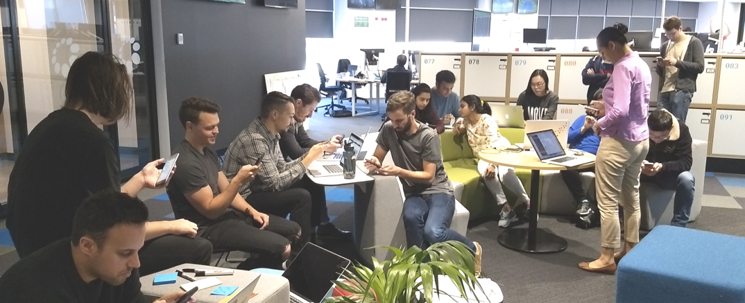
Paired with another UX Designer (Scotsman and fellow tea lover) Guy Ligertwood, I acted as the Lead UX for the project, the go to guy for all things Multiplier and Guy jumping in and assisting where possible. I was very fortunate to have a huge resource of iOS, Android and web developers at my disposal for this particular project.

Other stakeholders of the project included the wider business, we delivered updates weekly and made sure the Wagering Product Managers were kept up to date.

The problem

From the business perspective, other competitors were offering daily incentives for using their apps and TAB didn’t, and as a result loosing users comparative with last years user numbers. Senior stakeholders saw this as a prime opportunity to address to steady decline of TOTE (pool betting) bets at the same time.

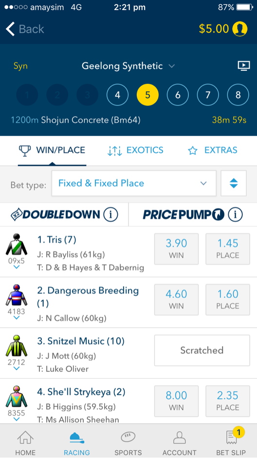
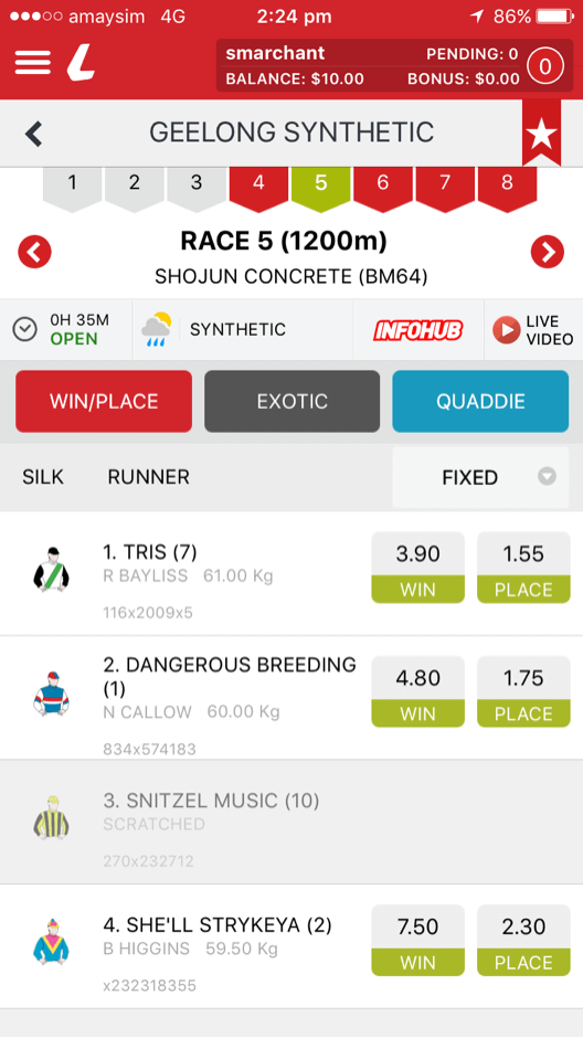
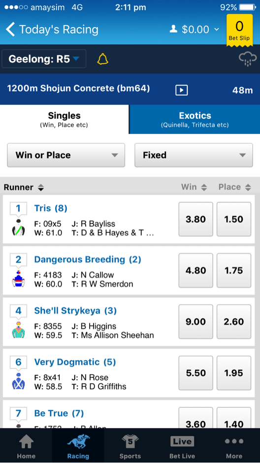
After speaking with users on their thoughts of TAB versus the competition, they felt the betting experience was lacking in personality and had limited functionality compared with competitor apps.

Goals

The goals were broken down into both business and UX goals:

Business Goals
  • 5% digital growth (cross channel)
  • Estimated net revenue 2017-2018 $9million
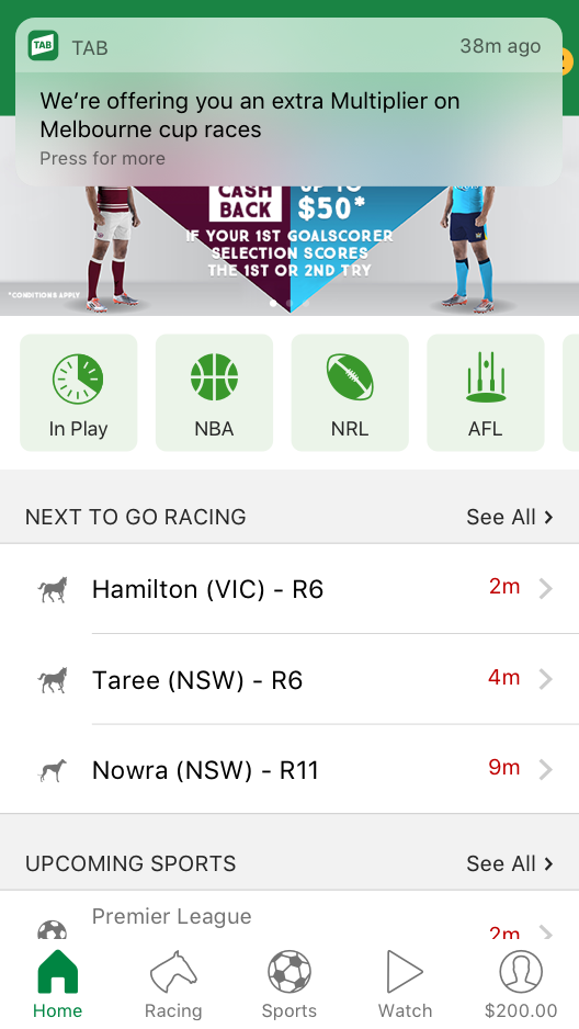
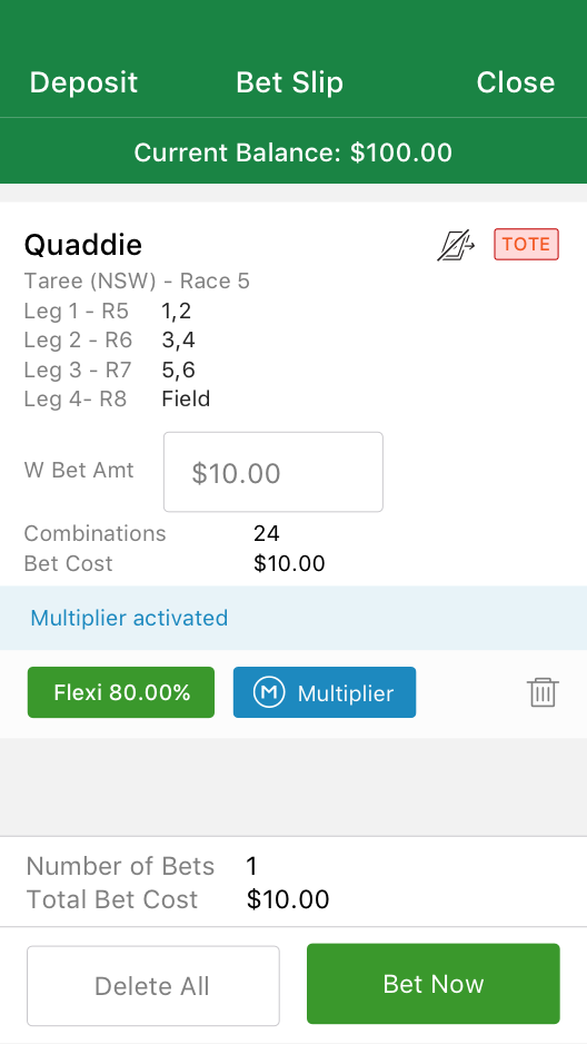
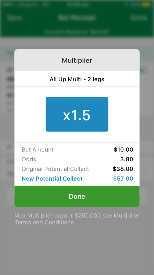
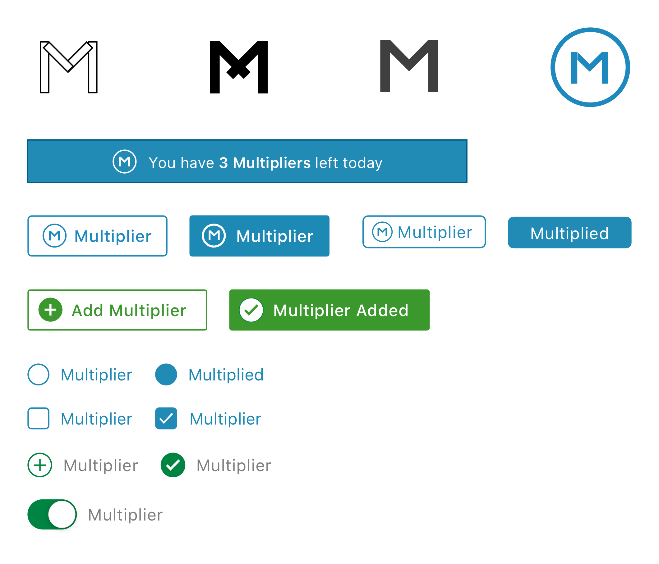
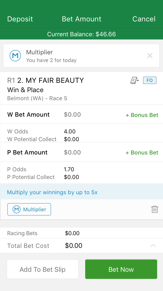
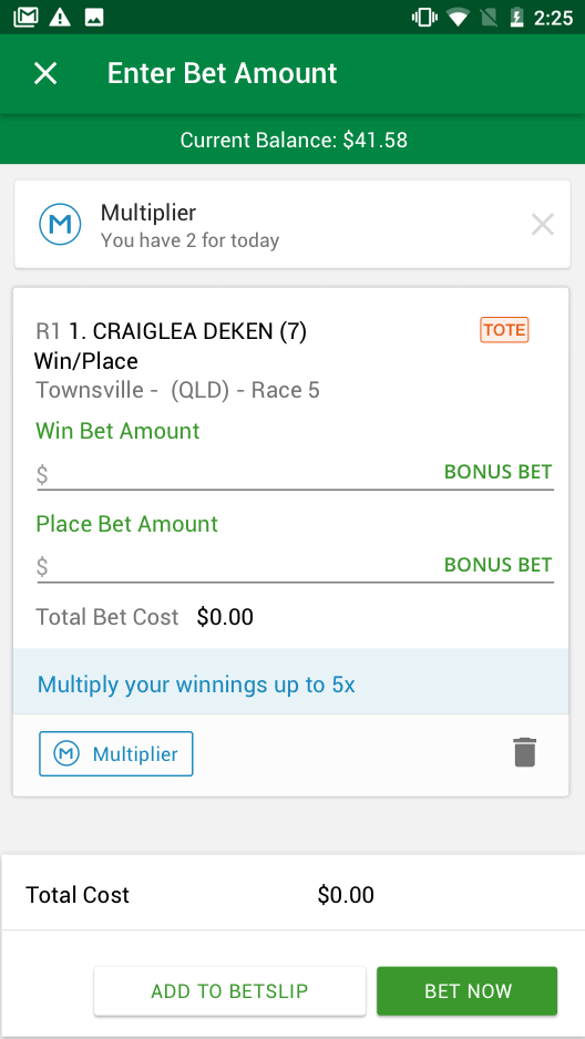
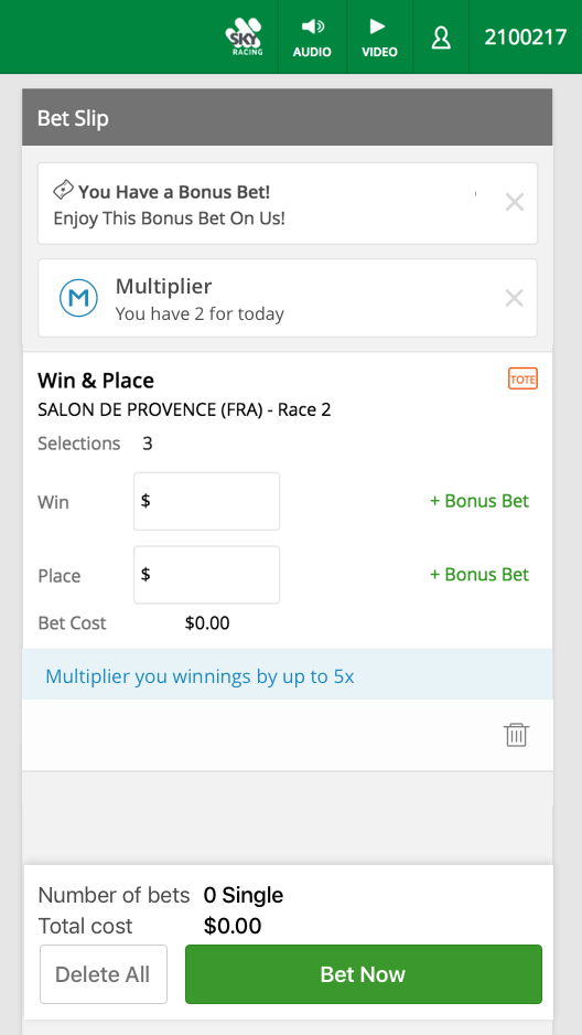
  • For everyday bets to include Multiplier
  • Consistent journeys across Android/iOS/web
  • A hard launch date of October 2018
UX Goals
  • To easily find out about the new Multiplier feature
  • Understand the business rules around Multiplier
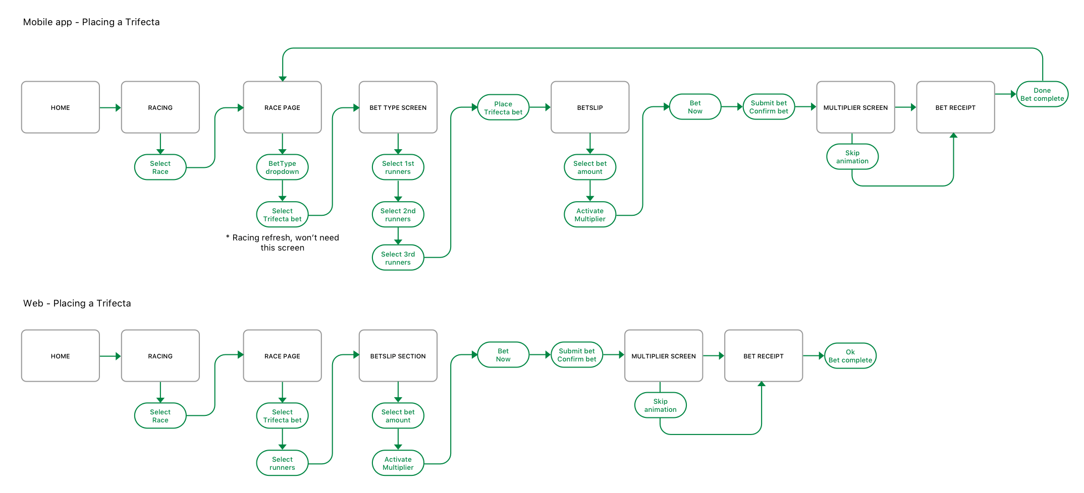
  • For the Multiplier journey to be consistent across apps and web
  • To add Multiplier to valid bet types
  • To be informed when special events have Multipliers
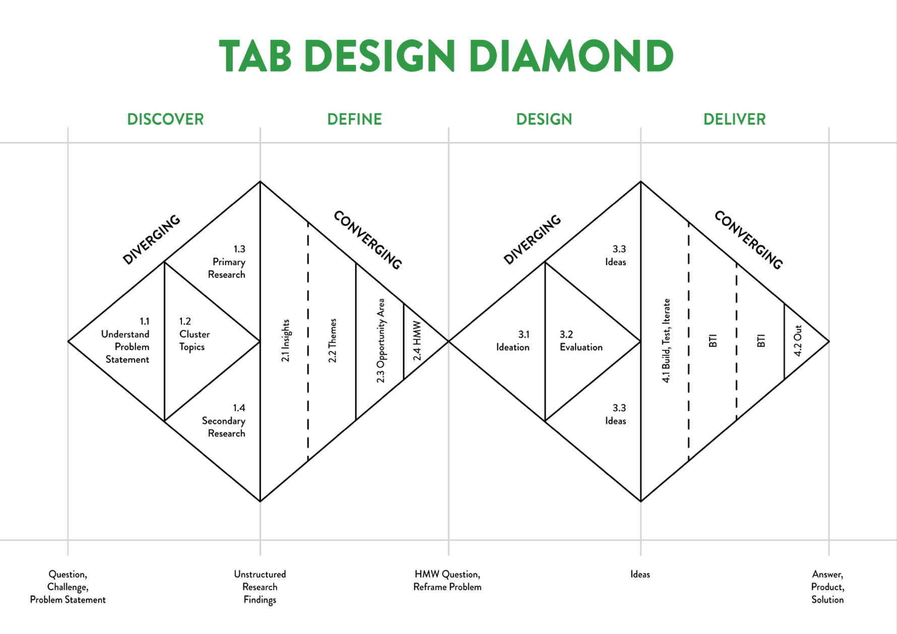
Planning & Research

The first step was to size the Multiplier project. Carried out by a few members of the UX team, using sizing cards and a detailed plan of what areas UX will be focusing on. With 2 dedicated UX designers, we estimated that the project would take 12 weeks to complete. The work was then divided, documented and communicated back to the business. Once the wider business knew of the UX timeline then the developers could add in their sizing estimates.

Working with the head of customer research (Levi McCusker), a Kanban board was created to map out all of the research goals. The goals included gathering quantitative research through surveys, qualitative research via in person usability testing sessions and deepening our knowledge through a workshop. Luckily for me, TAB has a huge database full of users who were dedicated to the brand and very willing to be taken through usability testing.

The first step was to map out potential user journeys to highlight any problem areas and highlight areas of opportunity.

One of many user flows created to tease out any potential issues users may have

For the competitor analysis, the focus was around 3 main competitors: William Hill, Ladbrokes and SportsBet. Particular attention was given to not only the experience but the animations/micro interactions also.

Next up we ran a workshop for a couple of hours one evening with 8 participants, split into 4 groups with a UX facilitator on each team. We asked each of the participants a series of questions and noted down the answers on post-its. The workshop uncovered some interesting insights:

  • Overall users felt the feature was similar to that of the competitors
  • 5 of the 8 participants saw value in the offering
  • 6 of the 8 participants preferred the Multiplier to appear as a decimal rather than percentage (this was really key for when we moved into the design phase
  • 5 of the 8 participants thought that this would devalue the parimutuel/pool betting by taking away money from other pools
  • Preferred method of communication was email, closely followed by SMS with a link to the website and/or app
  • All 8 participants wanted a clear and concise description of what the Multiplier was, either within the comms email or through a dedicated page on the website
  • 7 of the 8 participants said that the animation would add excitement when betting
  • 5 out of 8 participants had no problem with the Multiplier coming after bet placement (this was a concern raised during the earlier stages of the project)

During half way through the research phase an issue had arisen amongst the business about displaying percentages versus decimal, so I worked with George Tjam (UX Researcher) to create a survey. The general consensus amongst the digital team was split but the survey results showed that users found percentages easier to understand.

Throughout the whole project I was constantly ideating with developers, checking our design thinking and getting feedback to see what was possible. I found the easiest way to communicate my designs was through prototyping using InVision, the developers could then check out how the flow and go over it in their own time.

Design and test

After speaking with different areas of the business and gaining as much research as possible, Guy and I decided to get the wider UX team involved. We started by giving high context then we ran a Crazy 8’s session. The session proved valuable as it surfaced some interesting ideas we hadn’t thought of. After the session I went away and picked the best ideas to explore further.

At Tabcorp we had a community of users who would participate in user testing sessions for credit on their TAB accounts. These sessions proved invaluable when commuting our design thinking back to the business. We made sure that everything was shown to the user, from the branding to the final written copy to document their thoughts and reactions.

Branding and UI concepts for the new Multiplier feature

Build

During the final stages of the design I pieced together all of the Multiplier designs and put them into an annotated document. The developers then used this (as well as the prototypes) and turned them into Jira tickets. Designs were broken down into web/iOS app/Android app, then assigned to a developer. At this stage any of the senior stakeholders could easily monitor the progress and the lead time from the epics, stories and tickets in Jira.

Although this system worked well, the business came back late in the project and wanted to change some of the designs. The lead developers raised this as an issue early on and suggested we started using InVision Inspect as a collaborative way for all areas of the business to have transparency on the latest designs.

After the majority of the Multiplier feature was coded and deployed onto test devices, we ran a bug bash. This insured all of the UX was working as it should be, it was also a good time to point out any elements that weren’t pixel perfect. The bug bash proved to be very successful and only minor styling adjustments were raised and then documented as tickets in Jira.

Some of the UX team and the developers testing the Multiplier on Android and iOS devices

Product release

With such a large feature and big change to the experience, we decided to stagger the release, only releasing to 10 high valued customers as initial release. The next week we released to 1000 regular customers, ironing out any problems and finally releasing to all customers. From initial release, everything was running well and users managed to grasp the feature very quickly after just one use.

The outcome

Before launching the Multiplier project, we created a page to pull Google Analytics insights. It quickly helped visualise how the Multiplier was doing and what devices users were using when placing a Multiplier. Again, this gave senior stakeholders a central place to monitor insights and receive live updates.

After launch, we saw an increase in the amount of daily bets placed and almost all users within the app and the web app using the Multiplier feature. We gathered the insights from last years data, compared with the Multiplier launch and the numbers looked great. We received lots of great feedback from different areas of the business as well as from users on betting forums.

Final iOS Multiplier
Final Android Multiplier
Final Mobile web Multiplier

Final takeaways

Key learnings

  • I learnt how to communicate effectively early and often to my fellow UX Designers and developers
  • I found enthusiasm for my work made others want to work with me
  • Large scale features require huge team effort and consistent collaboration

What I'd do differently

  • I would have focused some attention around version 2 of the feature and documented future state thinking
  • Celebrated my success, and reflected on what we achieved as a team
  • Shared my experience with the wider design network (through a blog post/article/social media post)
Next project →

More projects...

Levi’s Assortify

Reimagining internal tools

ESMA

Discovering what’s possible

Nando’s ID

Reworking login & sign up flows