Nando’s ID

Reworking login & sign up flows

Overview

Nando’s is one of the largest chains of chicken restaurants in the UK. Red Badger was brought in to help streamline the interaction with technology and the Nando’s staff (Nandoccas) within restaurants. The integration with the business quickly grew and Red Badger had multiple teams working on different stages of the user journeys.

The team

The cross-functional Identification team consisted of a tech lead, project managers, software engineers, UI designers, and myself solely working on the UX.

My role was to analyse user feedback, examine existing user journeys to look for areas of improvement (and problem areas), facilitate sessions with stakeholders/users, and work closely with UI Designers, and the dev team to implement new solutions.

The problem

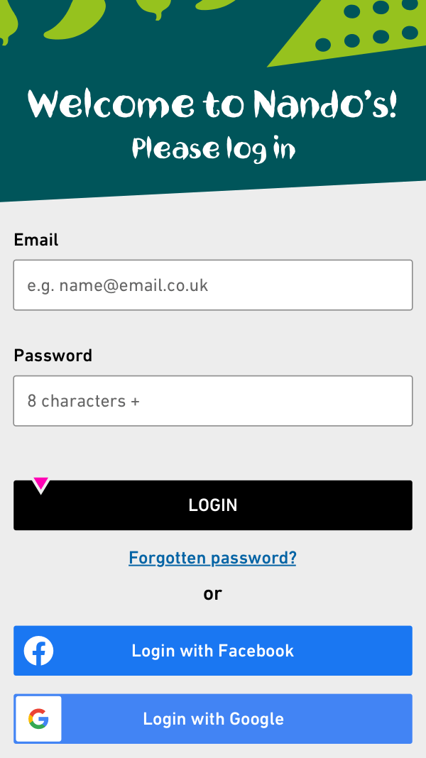
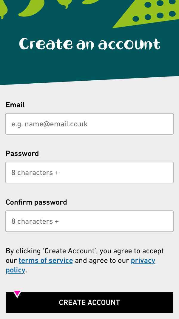
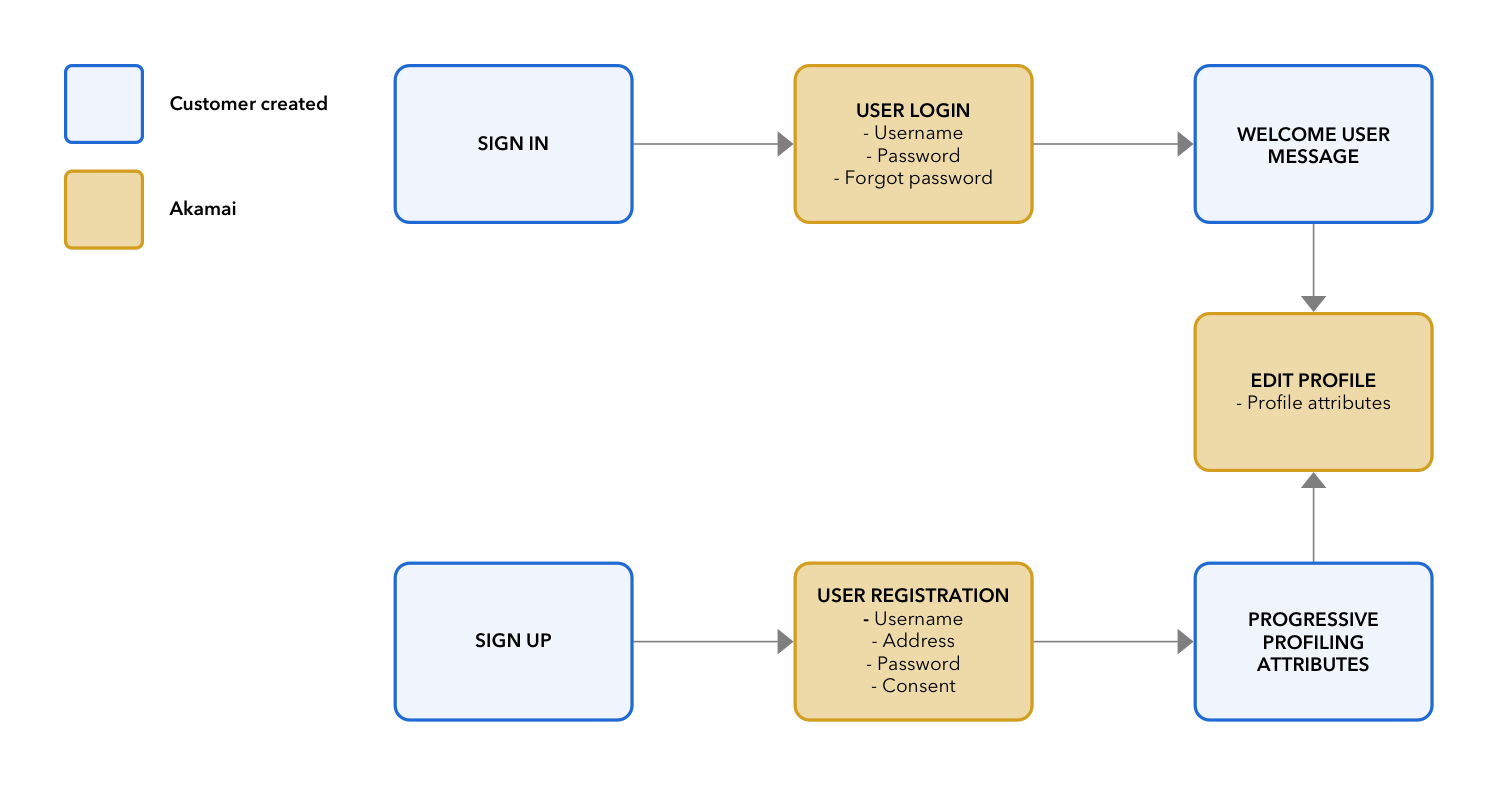
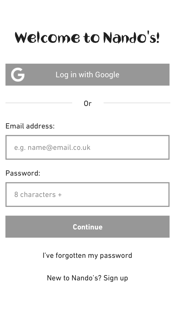
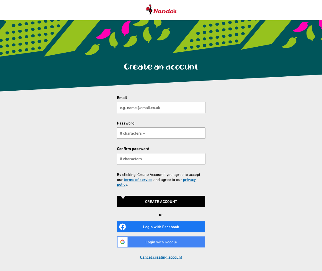
Nando’s was losing business due to friction points in the online food ordering journey. The main problem was the signup and login experience. Users, we’re highlighting issues when ordering at a table in a Nando’s restaurant or through the website and mobile applications.

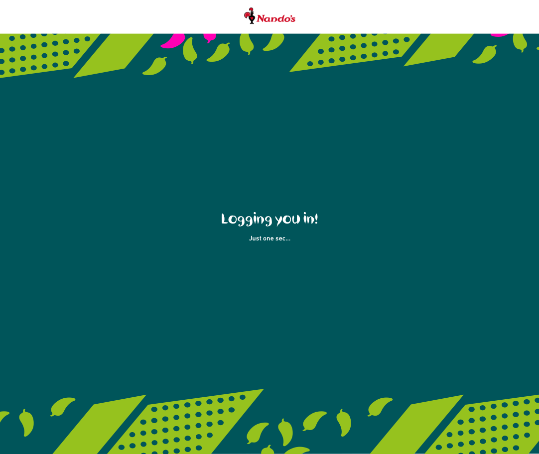
A combination of old technologies, strange page re-directs, and no loading states made the experience confusing and users were left stranded with no options to contact support.

Research

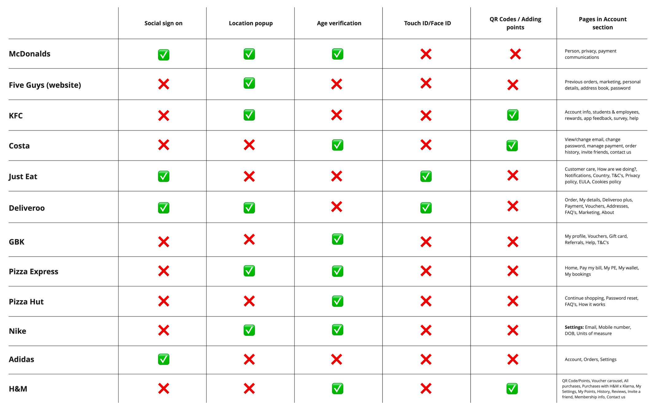
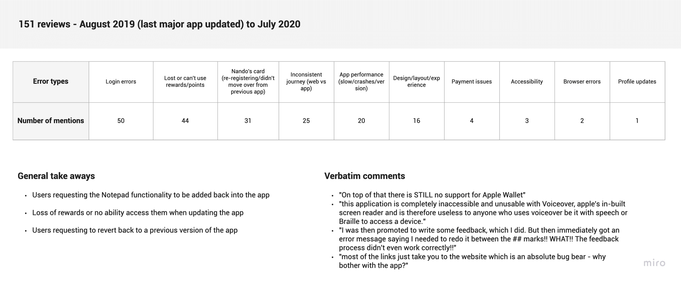
Working closely with Tina (Nando’s dedicated UX Researcher) we came up with research strategies to get to the bottom of the user frustrations. We kicked things off by creating a landscape analysis, looking at competitor’s experiences as well as non-competitor examples to draw inspiration from.

To better understand the gaps in the food ordering experience I mapped out a current user journey. Running the analysis across multiple different device types gave the team (and the business) insight into the whole process and the gaps that presented themselves.

After mapping out the journeys I wanted to see what users were saying verbatim, so I started the process of looking through iOS app store feedback from the last update. To gather feedback on the web journey I reached out to the customer care team and sifted through comments sent via the website.

Research insights

  • Users were frustrated with logging in, and signing up and just wanted to order their food quickly
  • Gen X & Gen Y users struggled the most, sometimes giving up on their journeys, with Gen Z typically being more tech-savvy and pushing through
  • Several users were losing their rewards or not being able to access them with the latest update of the mobile app
  • Users wanting to revert to a previous version of the app/website

Tech frustrations

A big frustration from the team’s perspective was that we were using a third-party solution to handle the new login and sign-up experience. From Nando’s perspective, it was a cheaper and quicker solution, however, it meant we had little control over the styling and the UX.

An option to create the whole experience ourselves was presented back to the business, but the time and cost outweighed the benefits of a third-party solution in the short term.

Akamai hosted login pages vs web pages we had full control over

The design process

Our team opted for a modified version of Google’s double diamond process (current Red Badger process) and Nando’s were well versed in Agile and agreed with the approach. Nando’s is split into Agile cross-functional domain teams, this made it easy for my team to focus on specific parts of the user journey.

During my time at Nando’s, we moved our design libraries from Sketch Cloud to Abstract and this was implemented to create version control within the design files. Design guidelines, Design libraries, and brand guidelines made the direction clear when designing and thinking about new features.

A phased approach

From our user research insights, and a deeper understanding of our technical constraints, the team and I worked with the project manager to create a release plan. The release plan would ensure that all of the team's great ideas would have a place in future releases. We knew from the competitor analysis that the majority of the competition had implemented Touch ID/Face ID. This allows users to access their accounts quickly. Implementing Touch ID/Face ID would greatly reduce the time to log in and order food.

Release plan to ship future features and ensuring continuous improvement

Sketching and wireframing

With everything that we had learned from the research and the business, I made a start on the sketches and rough wireframes. I looked at future state ideas as well as all the restrictions we were currently facing with the third-party solution.

Once I was happy with the direction of the wireframes and the general flow, I worked with Dan Chippendale, our very talented UI designer to take my rough ideas and turn them into fully branded and glossy designs.

Existing web login screen
Intial ideas and sketches
Wireframe created in Sketch

The outcome

Constrained by third-party technologies, we were able to release a new and updated login/sign-up experience.

Negative comments within both the iOS App Store and Google Play Stores were more than halved and the customer support teams received less negative feedback on the login and signup journeys.

Another highlight was the performance, shaving almost 9 seconds from the previous iteration to a mere 1 second with our freshly implemented update. Error pages were now styled and made consistent with the help of branding and copy changes, this left users less confused when encountering errors.

Final takeaways

Key learnings

  • Working within the constraints of the third-party software is difficult, but having future state ideas in your back pocket can help when presenting back to the client
  • Users weren’t expecting groundbreaking designs but for pages to be functional
  • Error pages play a big part in the overall experience and shouldn’t be overlooked

What I'd do differently

  • I would have made a stronger case for creating our own solution rather than relying on third-party software. The team and I could have had more control and ultimately a better experience
  • Work with the developers, to showcase a prototype of a future state solution to Nando’s to show what we could build
  • Incorporated analytics into the journey to feedback data on parts of the experience that were working well (and not so well)
Next project →

More projects...

Nando’s hackathon

A mini game whilst you wait

TAB Multiplier

Multipling your odds whilst betting online

Levi’s Assortify

Reimagining internal tools